There are 2 ways to insert it, depending on the purpose.
Everything you need to know about Excel. Examples of functions and formulae, charts, tips, tricks, pivot tables, macros, power pivot
I hope you do enjoy this free blog. I only ask one thing from you in return, click in one of the ads
Monday, 11 May 2015
How to add a line break to a cell in Excel
Today we are going to show you a little trick but that can be very useful. How to insert a line break in a cell.
Tuesday, 5 May 2015
Another way to count unique values in a range in Excel
Not long ago I wrote an article about how to count the number of unique values in a range. That trick was basically using the SUMPRODUCT and COUNTIF functions. Today we are going to see another way to calculate it.
To understand what we are trying to do it is always best to use an example. We have a list of names in the range A1: A14, which we have called Name_list.
How many of these names are unique? The answer is obviously 11. But how we calculate it? We saw earlier that can be calculated using the SUMPRODUCT and COUNTIF functions, but today I want to show you another way to perform the same calculation, but this time using the FREQUENCY and MATCH functions.
And what formula is that?
Thursday, 30 April 2015
An Excel dashboard about the UK general election 2015
Hello Excel-folks, today I want to share with you a nice informative Excel dashboard that I created for the UK general election on May 7th. I focused on the main 7 parties (those ones that appeared on the ITV debate). See how the dashboard looks like in a few screenshots:
Monday, 27 April 2015
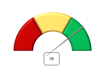
How to build a Speedometer chart in Excel
Hello, today we will see how to create one of those cool charts in Excel. The Speedometer chart.
And how do we make it? Let's see step-by-step.
Monday, 20 April 2015
The Excel dashboard about Real Madrid Tenth Champions League win 2013/14
Hello Excel fans. Today I would like to mix two of my passions. As you all know I love Excel, but I also love football and am a supporter of Real Madrid. Although it is best to have the full story so that everybody understands. My whole family are Atletico Madrid supporters, in fact I was born as an Atletico fan and I remember going to the Vicente Calderon when I was little, but when I was 5 years or so I changed my team and I became a fan of Real. Why? Because my favourite player was playing for Atletico and then he signed for Real, and I followed him....... Who is he? The incredible Hugo Sanchez. I was so passionate about how he played and his somersaults as goal celebration, and besides, I also played football with the number 9. Anyway, so today I consider myself a fan of Real Madrid but I still have much appreciation to Atletico. So, back to Excel, I have decided to create a small tribute to Real Madrid for the achievement of the Champions League win last year: the Tenth European Cup, and everything will be done in Excel. So even if you are not Real Madrid supporter or do not even like football, check the dashboard and I am sure you will find it interesting.
First let's see how it looks:
Friday, 17 April 2015
An alternative to traditional charts in Excel - Sparklines
Hello everyone
Today let's talk about something that Microsoft introduced for Excel 2010: Sparklines!
These geniuses that can make visualisations easier and faster. There are many times we show a lot of charts and we can overload our presentations, and a simple chart (or sparkline in this case) would be sufficient to convey to the listener what you intend to do.
Sparklines are tiny charts that are aligned to a row of a table of data and help you visualize the data to show a quick visual representation. They are basically in-cell charts.
Today let's talk about something that Microsoft introduced for Excel 2010: Sparklines!
These geniuses that can make visualisations easier and faster. There are many times we show a lot of charts and we can overload our presentations, and a simple chart (or sparkline in this case) would be sufficient to convey to the listener what you intend to do.
And what are Sparklines?
Sparklines are tiny charts that are aligned to a row of a table of data and help you visualize the data to show a quick visual representation. They are basically in-cell charts.
Monday, 13 April 2015
15 functions in Excel for any user - Part 1
Today I will talk about Excel functions, one of the most important tools in Excel. We will create a list of 15 functions not very used but that can be very, very useful at some point. This entry is the 1st of 2 entries. Here it goes!
Sometimes the data are cluttered, dirty, with spaces where you do not want to have, right? As one of the most useful ways to help you clean your data is the TRIM function.
This function removes all spaces from a string except for single spaces between words. Let us examine an example.
=TRIM("The wizard of Excel ") = The wizard of Excel
The function has removed those spaces before, after and in between to leave the text clean and ready for analysis.
1. Remove the spaces from a text except single spaces between words
Sometimes the data are cluttered, dirty, with spaces where you do not want to have, right? As one of the most useful ways to help you clean your data is the TRIM function.
This function removes all spaces from a string except for single spaces between words. Let us examine an example.
=TRIM("The wizard of Excel ") = The wizard of Excel
The function has removed those spaces before, after and in between to leave the text clean and ready for analysis.
Tuesday, 7 April 2015
Welcome to Malta - a dashboard in Excel about this beautiful island
Hello everyone. I guess most of you do not know that I live in Malta. I live in this beautiful island since September 2014. To celebrate my adventure and try to convince my friends to come and visit, I have created a dashboard in Excel about the island. The dashboard runs smoothly in Excel 2007, 2010 and 2013. Other versions have not been tested.
And what is a dashboard?
Friday, 3 April 2015
How to build a Thermometer chart in Excel
Hello, today we will see how to create one of those nice charts in Excel. The Thermometer chart.
And how do we make it? Let's see step-by-step.
Tuesday, 31 March 2015
COUNTIF tips
The COUNTIF function can provide us with very useful information. From a range you can count empty cells, the non-empty cells, or cells with all text. Let us see it with an example.
Monday, 30 March 2015
Tutorial about charting in Excel
Here you will find all the explanations for the charts that I've been putting on the blog:
1. Tornado chart
2. Waterfall chart
3. Band chart
4. Thermometer chart
5. Speedometer chart (coming soon)
6. Growing moustache chart (coming soon)
7. Sparklines (coming soon)
8. In-cell horizontal bar chart using REPT function (coming soon)
9. In-cell vertical bar chart using REPT and CONCATENATE functions (coming soon)
10. Panel chart (coming soon)
1. Tornado chart
2. Waterfall chart
3. Band chart
4. Thermometer chart
5. Speedometer chart (coming soon)
6. Growing moustache chart (coming soon)
7. Sparklines (coming soon)
8. In-cell horizontal bar chart using REPT function (coming soon)
9. In-cell vertical bar chart using REPT and CONCATENATE functions (coming soon)
10. Panel chart (coming soon)
Thursday, 26 March 2015
Introduction to band charts in Excel
Today I want to talk about creating band charts in Excel. I use them quite a lot as they help the user to a quick understanding of the visualisation without overloading the chart.
So that we all understand, what I intend to show you is a chart like the following:
The band represents the area between the maximum and the minimum for all products for any one year.
It can also be seen that it is a dynamic chart, each time a product is selected one series in the chart change (could be more if you wanted).
To build a band chart like that one we need to follow a few steps. Let's see how.
So that we all understand, what I intend to show you is a chart like the following:
The band represents the area between the maximum and the minimum for all products for any one year.
It can also be seen that it is a dynamic chart, each time a product is selected one series in the chart change (could be more if you wanted).
To build a band chart like that one we need to follow a few steps. Let's see how.
Sunday, 22 March 2015
Selecting a range from many using the CHOOSE function
A while ago I wrote about the how to convert long NESTED IF formulas to a simple formula with the CHOOSE function. Today we are going to see what else we can achieve by using the CHOOSE function.
We can fetch a range from a selection of ranges
How do we do that?
Let's see by looking at one example:
Say that we have 4 ranges, {A1:A10}, {B1:B10}, {C1:C10} and {D1:D10}, and that depending on a condition or a selection by the user we want to use one of them, for example, we want to sum up the range.
=SUM(CHOOSE(2, A1:A10, B1:B10,C1:C10,D1:D10))
Thursday, 19 March 2015
5 cool tricks for PivotTables
Today we are going to see 5 super tricks to use when working with PivotTables. With these tricks you will increase the potential of the functionality of our good friends the PivotTables.
1. See which transactions make up a value in the PivotTable
Monday, 16 March 2015
How to count the number of unique values in a range in Excel
Hello, on many occasions we have a list or range with lots of data, and we wondered how many of those values or data are unique, and we have had to develop a complex solution by adding helper columns and doing multiple operations.
Because we can calculate the number of unique values in a list with a simple formula.
And what formula is that ?? Let's see ...
That is no longer necessary !!
Because we can calculate the number of unique values in a list with a simple formula.
And what formula is that ?? Let's see ...
Thursday, 12 March 2015
Array formulas in Excel
What is an array ??
The term array refers to a collection of data residing in a column or row of Excel or a combination of them. In Excel, these elements may reside in a single row (what is called a one-dimensional horizontal array), a column (one-dimensional vertical array ) or multiple rows and columns (two-dimensional array). In Excel you can not create array formulas or arrays that are three-dimensional.
And an array formula ... ??
"I have enough with the formulas, and now you talk about array formulas.. Help!!"...
If you feel like this right now wait, they are simpler than the name suggests, and learning them it is for Excel power users.
Tuesday, 10 March 2015
How to calculate AGE in Excel
Well today I want to look at one of those problems we face from time to time, and that is none other than how to calculate the exact age using Excel, and considering that having to include leap years can present a bigger challenge than we initially anticipated. Well let's see how it's done.
In this tutorial we will look at three methods to calculate age in cell C2, being cell A2 the date of birth and B2 today's date, calculated through the Excel function TODAY.
Thursday, 5 March 2015
Conditional Formatting - Formula to search values
Today we are looking at another example of using formulas in conditional formatting.
It is recommended to first read and understand the entrance Conditional Formatting - formulas for selecting cells.
Imagine you have the list of European football teams, located in the range B5:B31.
It is recommended to first read and understand the entrance Conditional Formatting - formulas for selecting cells.
Imagine you have the list of European football teams, located in the range B5:B31.
What we want to achieve is to enter some text in a cell, for example D2, and if that text is in any value from the list then highlight the cell(s) in the way you want.
To do that the formula to be used is:
Conditional Formatting - Formula to highlight duplicates, errors and omissions
Today we are looking at another example of using formulas in conditional formatting.
It is recommended to first read and understand the entrance Conditional Formatting - formulas for selecting cells
1. Highlight duplicates in a list
For this example we will use a standard list of data like this. This list is in the range B7:B23.
So the formula to highlight duplicates is:
=COUNTIF($B$8:$B8,$B8)>1
Tuesday, 3 March 2015
How to build a Waterfall chart in Excel
A Waterfall chart???? Yes, in this post we are going to see what I mean by that.
The Waterfall chart in Excel is a type of chart that includes what appears to be floating columns, which help to better visualize the contribution of all parties to the total.
Subscribe to:
Posts (Atom)