Showing posts with label Charts. Show all posts
Showing posts with label Charts. Show all posts
Monday, 27 April 2015
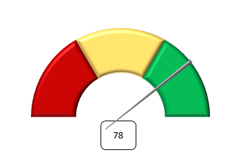
How to build a Speedometer chart in Excel
Hello, today we will see how to create one of those cool charts in Excel. The Speedometer chart.

Friday, 17 April 2015
An alternative to traditional charts in Excel - Sparklines
Hello everyone
Today let's talk about something that Microsoft introduced for Excel 2010: Sparklines!
These geniuses that can make visualisations easier and faster. There are many times we show a lot of charts and we can overload our presentations, and a simple chart (or sparkline in this case) would be sufficient to convey to the listener what you intend to do.
Sparklines are tiny charts that are aligned to a row of a table of data and help you visualize the data to show a quick visual representation. They are basically in-cell charts.

Today let's talk about something that Microsoft introduced for Excel 2010: Sparklines!
These geniuses that can make visualisations easier and faster. There are many times we show a lot of charts and we can overload our presentations, and a simple chart (or sparkline in this case) would be sufficient to convey to the listener what you intend to do.
And what are Sparklines?
Sparklines are tiny charts that are aligned to a row of a table of data and help you visualize the data to show a quick visual representation. They are basically in-cell charts.
Friday, 3 April 2015
How to build a Thermometer chart in Excel
Hello, today we will see how to create one of those nice charts in Excel. The Thermometer chart.

And how do we make it? Let's see step-by-step.
Monday, 30 March 2015
Tutorial about charting in Excel
Here you will find all the explanations for the charts that I've been putting on the blog:
1. Tornado chart
2. Waterfall chart
3. Band chart
4. Thermometer chart
5. Speedometer chart (coming soon)
6. Growing moustache chart (coming soon)
7. Sparklines (coming soon)
8. In-cell horizontal bar chart using REPT function (coming soon)
9. In-cell vertical bar chart using REPT and CONCATENATE functions (coming soon)
10. Panel chart (coming soon)
1. Tornado chart
2. Waterfall chart
3. Band chart
4. Thermometer chart
5. Speedometer chart (coming soon)
6. Growing moustache chart (coming soon)
7. Sparklines (coming soon)
8. In-cell horizontal bar chart using REPT function (coming soon)
9. In-cell vertical bar chart using REPT and CONCATENATE functions (coming soon)
10. Panel chart (coming soon)
Thursday, 26 March 2015
Introduction to band charts in Excel
Today I want to talk about creating band charts in Excel. I use them quite a lot as they help the user to a quick understanding of the visualisation without overloading the chart.
So that we all understand, what I intend to show you is a chart like the following:

The band represents the area between the maximum and the minimum for all products for any one year.
It can also be seen that it is a dynamic chart, each time a product is selected one series in the chart change (could be more if you wanted).
To build a band chart like that one we need to follow a few steps. Let's see how.
So that we all understand, what I intend to show you is a chart like the following:
The band represents the area between the maximum and the minimum for all products for any one year.
It can also be seen that it is a dynamic chart, each time a product is selected one series in the chart change (could be more if you wanted).
To build a band chart like that one we need to follow a few steps. Let's see how.
Tuesday, 3 March 2015
How to build a Waterfall chart in Excel
A Waterfall chart???? Yes, in this post we are going to see what I mean by that.
The Waterfall chart in Excel is a type of chart that includes what appears to be floating columns, which help to better visualize the contribution of all parties to the total.

The Waterfall chart in Excel is a type of chart that includes what appears to be floating columns, which help to better visualize the contribution of all parties to the total.
Thursday, 12 February 2015
Highlighting maximum / minimum value of a series in a chart in Excel
Have you ever had a chart and wondered how you could highlight the maximum or minimum value of the series in that Excel chart.
We will discuss exactly that today.
Let's see how we can do it and create a chart like the one below:

We will discuss exactly that today.
Let's see how we can do it and create a chart like the one below:

Saturday, 7 February 2015
How to build a Tornado chart in Excel
Hello! In this post I want to explain step by step how to build tornado chart in Excel. If you are a little confused about what a tornado chart is then let me show you visually. Basically a tornado chart looks like this (the typical graph of population distribution by age):

Subscribe to:
Posts (Atom)